Carpentry website · Independent concept
Pro Build Carpenter
 04XX XXX XXX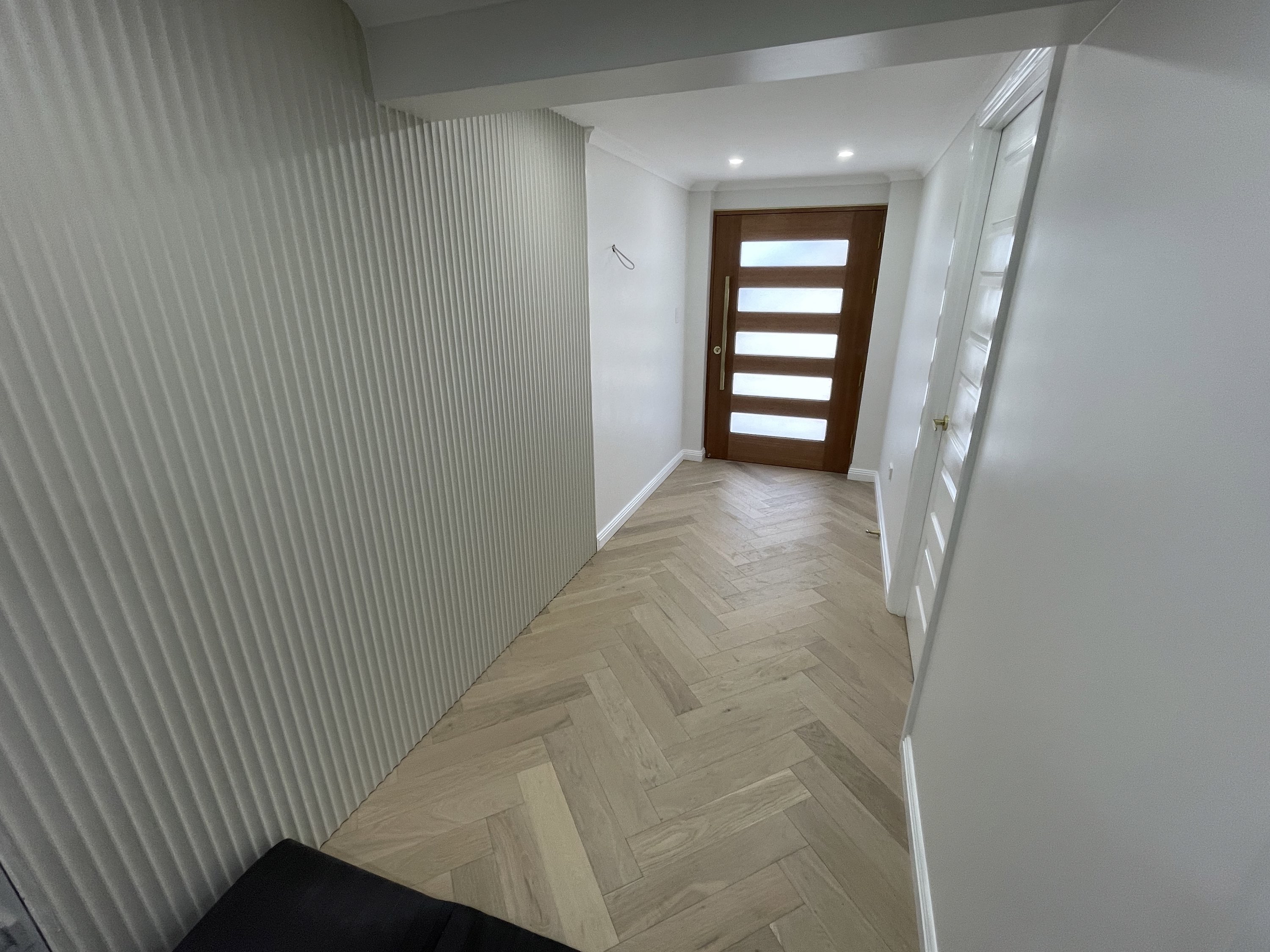
Detail that
changes the room.
Quality carpentry, renovations and property maintenance delivered by experienced local trades and trusted specialists.
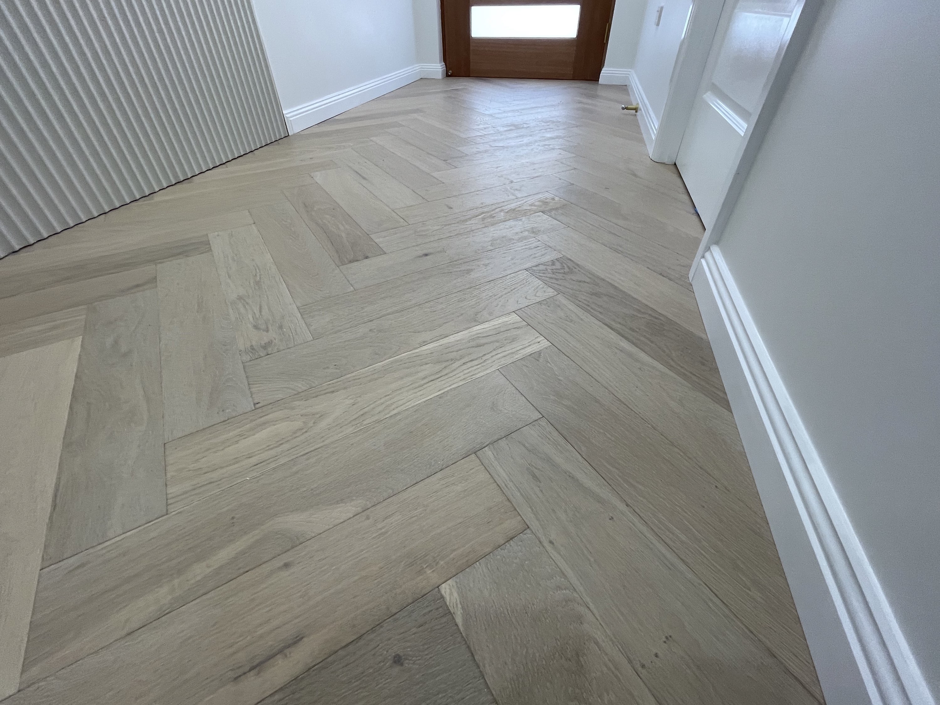
panellingHerringbone oak veneer flooring
One team.
A better finish.
From custom wall features to full-room renovations and ongoing commercial maintenance.
Built for the
way you live.
Pro Build’s in-house tradespeople and selected subcontractors work together to deliver a consistently high standard across every project.
A specific design for a specific business.
Craftsmanship presented with the confidence of the finished work.
The customer decision
A homeowner is trying to judge two things at once: whether the carpenter can produce the finish they have in mind and whether the team can manage the practical reality of the job. Strong imagery creates desire, but service coverage, location, coordination and quote expectations are what make an enquiry feel sensible.
The brief
The business covers a wide mix of carpentry, renovations and maintenance. The challenge was to show that breadth without making the website feel like a directory of unrelated services or losing the higher-quality position created by its feature walls, detailed finishes and completed rooms.
The website also needed to avoid a common portfolio problem: beautiful images with no explanation of what the business actually did. Prospective customers should be able to recognise the relevant service, understand the operating area and see a credible route to a quote without having to infer those details from a gallery.
The thinking
The design uses completed spaces as the primary proof because the desired outcome is visual and tangible. Photography establishes the standard first; concise copy then explains the type of work, where it is delivered and how the wider team supports it. This makes the visual promise easier to believe.
Services are grouped into a small number of customer-friendly pathways rather than listed trade by trade. Membership, service-area information and the free-quote route sit close to the work, reducing the perceived risk and effort of taking the next step. The site can therefore feel premium without becoming vague or precious.
How the website makes the offer easier to choose
The concept is designed around four practical parts of the customer decision: the outcome they want, their confidence in the provider, how quickly they can understand the next step and how much effort the enquiry requires.
Sell the finished space, not a task list
The central promise is the improvement to the room and how it feels to live with, while the service categories explain how that result is delivered.
Use the work as relevant proof
Large project imagery demonstrates detail and finish more credibly than unsupported claims about workmanship.
Answer practical risk early
Service areas, trade coordination, membership and quote information reduce uncertainty about fit before the customer reaches out.
Make a broad offer easier to navigate
Four clear pathways help customers locate their type of job without forcing them through a long, technical capabilities list.
What shaped the direction
The main decisions behind the structure, visual language and enquiry path.
Let the finish lead
Large project photography establishes the standard immediately and gives the surrounding copy a concrete point of reference.
Group services by customer need
Carpentry, maintenance, renovations and specialist finishes are presented as clear entry points instead of one long capabilities list.
Balance polish with practicality
Warm materials and editorial typography carry the craft story, while service areas, membership and free-quote prompts keep the experience useful.
The concept gives Pro Build a more distinctive visual position while keeping its broader service offer and quote path straightforward.